
We build web and mobile solutions to accelerate your Success


About Us
We have a dedicated team offering solutions from Web and Mobile audit and architecture, Web Agile Development, Mobile applications development, and quality testing.
We take great pride in our work and everything we create is executed with precision and love.

Why Us
With a rich 15-year legacy, we take pride in serving global clientele with cutting-edge technology solutions. At the heart of success lies trust, which is why we extend our commitment further by providing FREE comprehensive Web Audits to our valued clients.
Take advantage of this exclusive opportunity to revolutionize your digital footprint and elevate your online success story!


How We Work

Application Architecture
We start with the application architecture, so it can give you a roadmap about how it works and what to expect. In this way, you end up with a well-structured application and a better idea about the Software design patterns.

UI / UX & Graphic Design
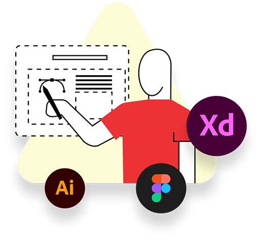
Our UI/UX & Graphic Design team is passionate about creating visually stunning and user-friendly digital experiences. We strive to strike a balance between aesthetics and functionality, delivering designs that captivate users while meeting business goals and objectives.

Web & Mobile App Development
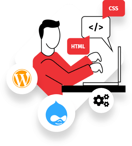
This is the work behind the scene, so we understand the importance of staying up to date with technological advancements and security best practices.
Our development team is collaborative, agile, and focused on delivering high-quality solutions and we also value collaboration, knowledge sharing, and personal growth, while striving to deliver exceptional software solutions for you.

QA Testing & Optimization
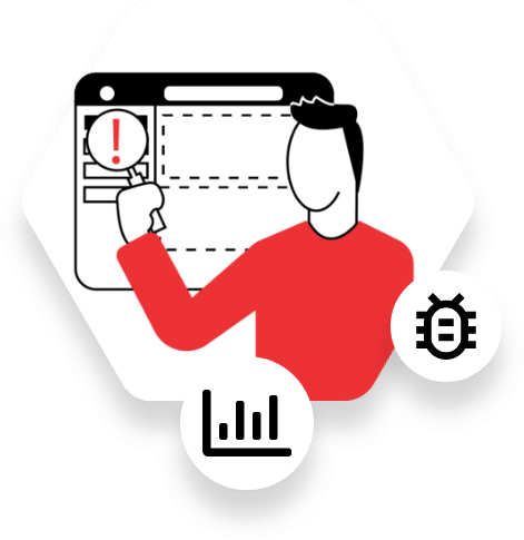
We are responsible! That’s why, before we deliver we make sure that everything works properly. We emphasize rigorous testing, code reviews to ensure the reliability, scalability, and maintainability of our solutions. We actively seek opportunities for process improvement and leverage modern tools and technologies to streamline our development workflow.

Launch & Maintenance
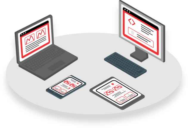
Our team ensures successful deployment and ongoing support. We meticulously plan and execute deployments, conduct thorough testing, and prioritize our user feedback.
Also, we proactively maintain and update software, provide excellent customer support, and strive for long-term client satisfaction and success.
Let’s Get In Touch